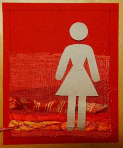
I received my package from Bernina in Johannesburg and opened it with excitement…. My optimism vanished quickly when I realized I had to work in red, not my favourite creative colour… But, I had to tackle the project and after thinking about it for about two weeks, I really had no idea what to do and the situation was becoming stressful. A breakthrough came when I realized I had to soften the background as the harshness of the red was my main obstacle. I decided to use the colour of the threads as guideline to soften the red and started placing strips of recycled sari silk scraps on the bottom section of the piece of felt. It seemed to do the trick and I added a piece of orange painted gauze as well as a strip of tulle. I cut my female shape and placed it on top to get the feel for the proportion and composition. My idea was to add smaller female shapes to create some depth and thought it could work with placing them between the layers. And so the title of my Pictogram was created, Layers of Society.
Auditioning silk scraps and gauze to soften background
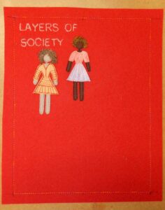
The title was embroidered onto the left top corner and I added the first two women, working from the top of the piece of felt. I could not resist dressing them and added hair made from needle-lace techniques using Avalon wash-away.
Title and first two women added
In South Africa, we live in a multi cultural society, so the women in this quilt represents the population across the racial spectrum. Although the full size woman appears to be a White woman, she is echoed in dark brown representing a Black women, it indicates that social standing exists regardless of race. This shape was fused onto dark brown felt and cut slightly bigger to create this effect. It also added extra dimension.
Layers of Society 2015
Often affluent people are the ones enjoying social standing with a voice in society. In contrast, often the poorer part of society forms the silent and faceless masses… For that reason, the females in the background are dressed modestly and portrayed as faceless without shoes to emphasize the difference….
 BERNINA Corporate Blog -


Very thought provoking indeed Marilyn. You have caught the mood so exactly with your scaled pictograms and I was moved by the lack of shoes on the smaller yet more numerous women on the piece. A striking image!
Thank you Jan.
All oh so true, sadly. I’m glad you found a way to express such a powerful message – and red seems to be the best colour for the background. Hilary
Yes, red is a powerful colour to convey this message.
Dear Marilyn, what a special idea and form of transforming it into this project, this is absolutely wonderful. I like this very much!
Thank you Jutta. This project really stretched me…
Really interesting work being done here. I like your “layers” Marilyn!
Thank you Trienie, it is really kind of you! xx